Butler Looney will serve Turner Duckworth?s latest work to the Dallas Society of Visual Communications on Wednesday, September 10, prompty at 6 p.m., at the Angelica Film Center in Dallas.
It was a packed auditorium this September as the DSVC welcomed Butler Looney ? Lead Designer at Turner Duckworth.
Bulter gave a great presentation on the methods of managing and distilling a brand down to its essential assets.
But, more on that in a bit...
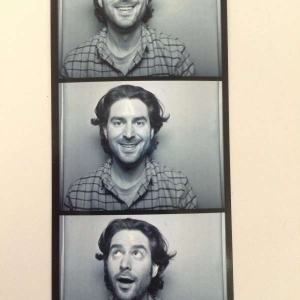
'Cause, while we were all there originally to see Butler, the opening act almost stole the show. It?s common for our speakers to have friends & family present in the audience when they come into town, but it?s not common to have such a hilarious and entertaining introduction by the speaker?s very own mother. With stories of eccentric birthday cake requests and an awkward, but funny run in with the law, Mother (Cathie) Looney took us through Butler?s ?wonder years? in a grand fashion.
Butler?s mom got a lot of love from the crowd.
--
?Mom is awesome! Butler is cool, too!? ? Kishya
?MORE MOMS. ?? ? Anonymous
?Your work is awesome! (and so is your mom)? ?Tiffany
--
And now, back to Butler, whose work is awesome, and his message simple ? do a lot with very little.

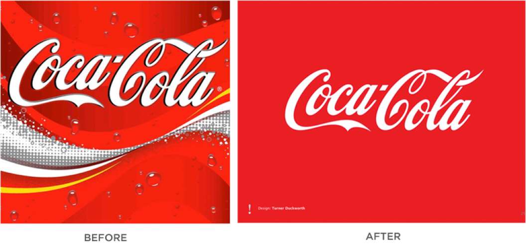
One of the main case studies he took us through was the work done for Coke. Coke came to Turner Duckworth with just a single brand image to get started. It was a mess. Apparently, every marketing manager that worked on Coke had made their "mark" on the brand. See that small line of yellow? That was to enhance "taste". The evidence of the brand confusion was evident in its marketing materials, as well.
Bulter explained, it wasn't enough to just create something recognizable. Everyone recognized Coke even as chaotic as it was. To make a great brand the elements needed to be ownable. They needed to distill the graphics down to those few elements that were uniquely Coke.
For Coke, the first and obvious place to start was the script logotype. It just needed to be simplified. From there, two more elements evolved; the bottle and the swash. Each had their place in creating iconic and ownable brand elements. While these elements now look simple and clean, the process of refinement was long and fastidious. A process Butler emphasized not to skimp on.
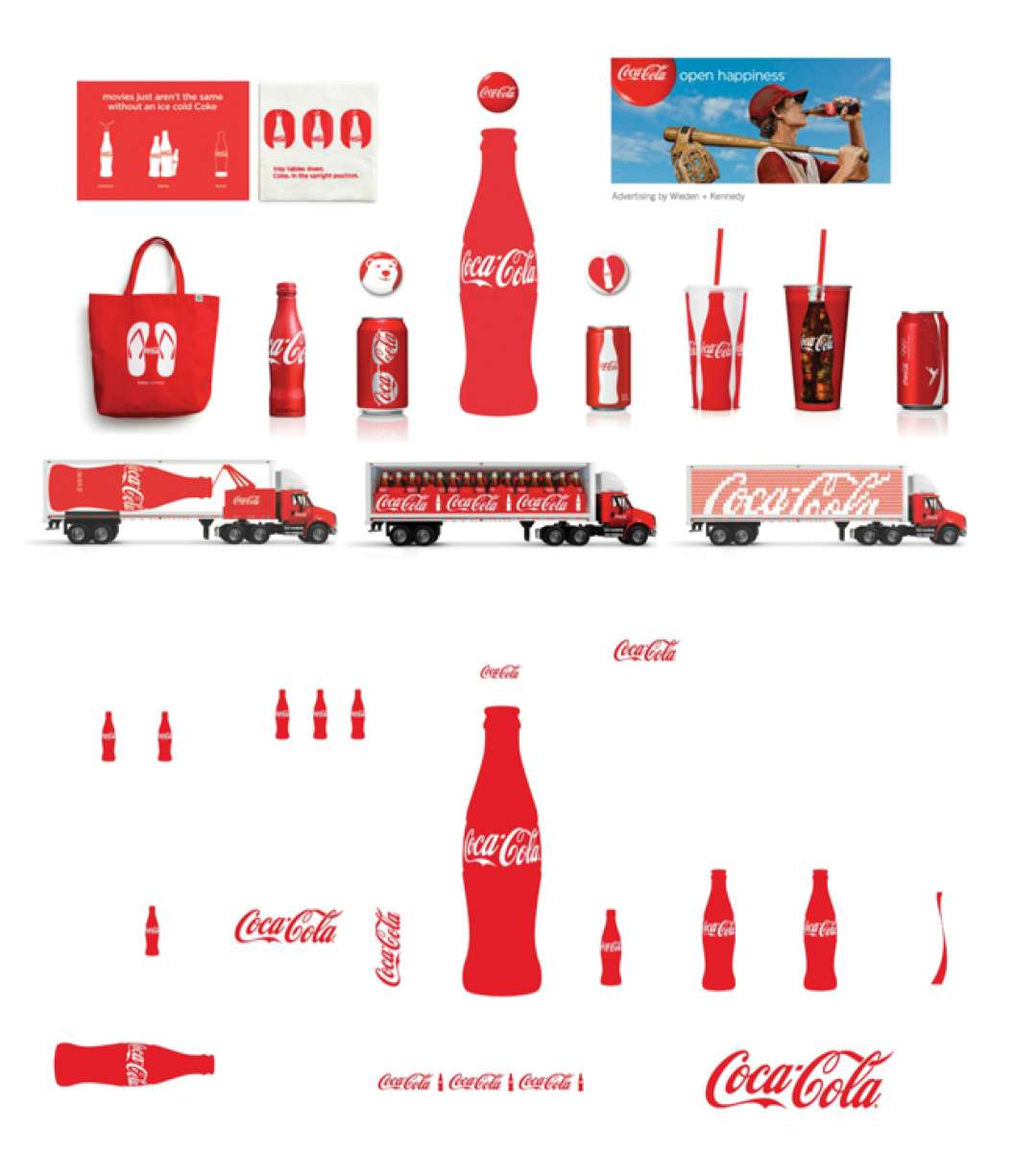
One of the many powerful images of the night was the juxtaposition of two images. The first image had various Coke brand elements on every type of media you could think of: billboards, flyers, t-shirts, cups, cans bottles, bags, truck graphics, etc. The next was the same image stripped down to just the iconic brand elements - bottle, swash, and script.

There was an audible "Oooohhh" from the audience at that point. There was a lot of that happening over the course of the night though, as Butler's message resonated with the audience.
--
"Iconic Design: Doing a lot with very little" ? Samantha K
"Simplify - go back to your roots" ? Leanne
"Do A LOT with very little" ? Mark E.
"Very inspirational. Simplicity!! Thanks Butler You Rock!" ? R. Hand
--
A big thanks to Butler (and his mom) for such a great presentation. And, thank you to all of our volunteers, board members and attendees who make DSVC lots of fun. DSVC meetings happen every first wednesday of the month ? we look forward to seeing you next month!
Who would you like to see at DSVC? Here are a few suggestions from the crowd.
Cathie Looney (yup, Butler's mom)
Chris Spooner
Scott Hansen
Jessica Hische


